Justin B. Post
Teaching Professor
Justin_Post@ncsu.edu (NC State)
919.515.0637
R Shiny Apps
Creating visuals to explain concepts or to show nuances can make a huge impact on student learning.

Having visuals that can be modified by a user allows students to ask their own questions, explore, and deepen their understanding.
R Shiny is a package in R that allows for the creation of dynamic visuals that can run R code on the back end. I use these types of apps in my teaching quite often. Below are some of the apps I use in my classes. All of the code for these apps is available in github repos.
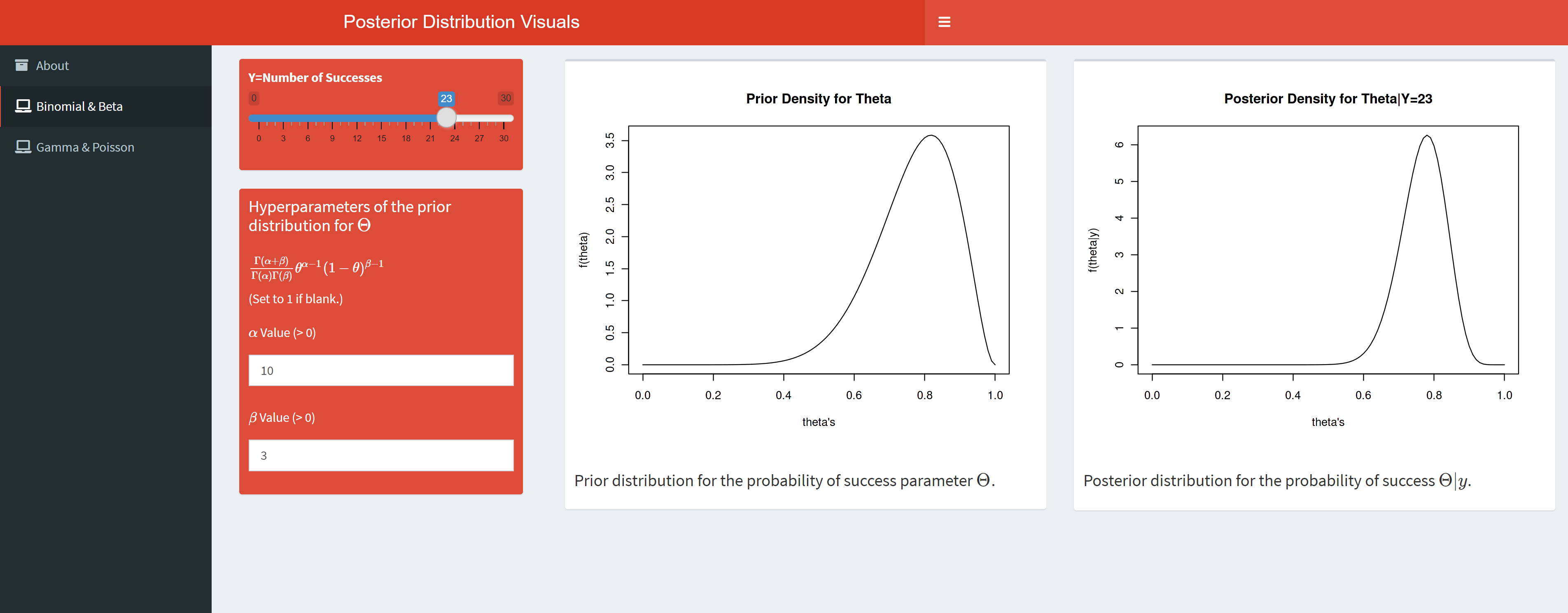
Basic Bayes App
This is a basic prior/posterior visualization app. You can see how the posterior changes under different likelihoods and prior distribution settings. Specifically, the Beta distribution as the conjugate prior for the Binomial and the Gamma distribution as the conjugate prior for the Poisson are implemented.
MCMC App
Metropolis Hastings visualization for an example where we know the posterior distribution. Specifically, this app demonstrates a basic implemention of the MH algorithm for the use of a Beta prior on a Binomial likelihood.

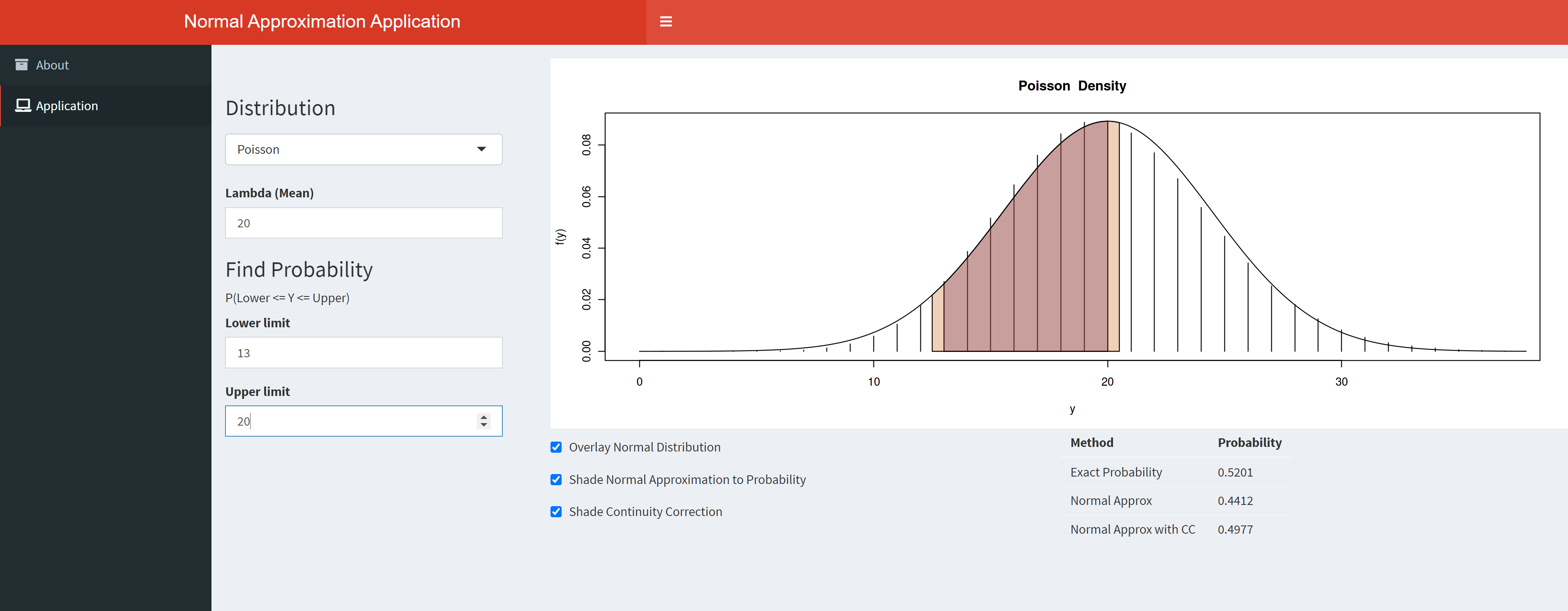
Normal Approx App
The commonly used Normal approximations to the Binomial distribution and to the Poisson distribution are visualized in this app. Continuity corrections are shown visually and compared to the exac and non-corrected probabilities.
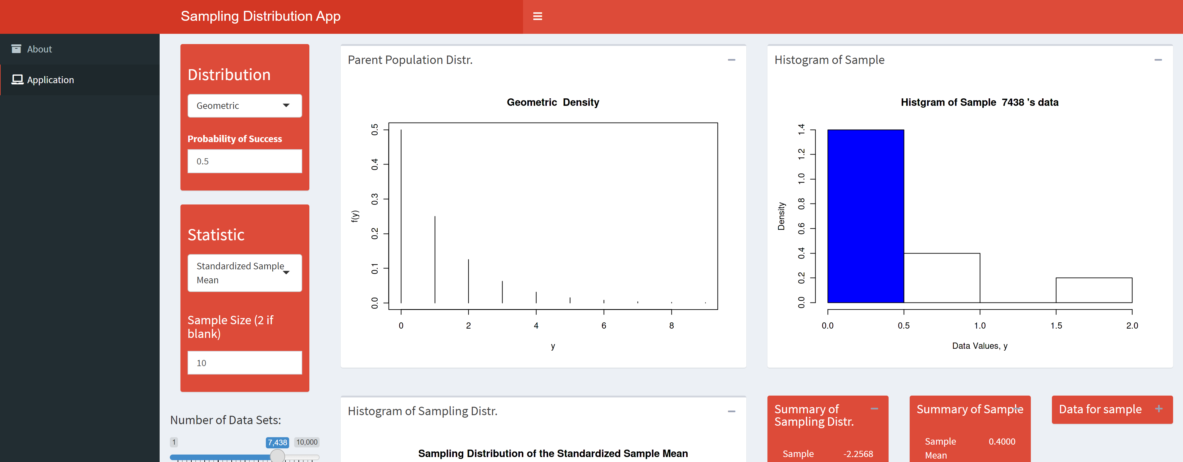
Sampling Dist App
This applet visualizes the sampling distribution of different
statistics. The parent population can easily be changed to many of the
commonly named distributions. Great for debunking the $n>30$ myth.
Order Statistics App
This applet simulates the distribution of an order statistic from a random sample of beta random variables. One of the biggest issues in teaching this material is to get the students to understand that there is a distribution for, say, the smallest value from the sample! The theory is given in the app along with a visualization of the joint distribution of two order statistics.

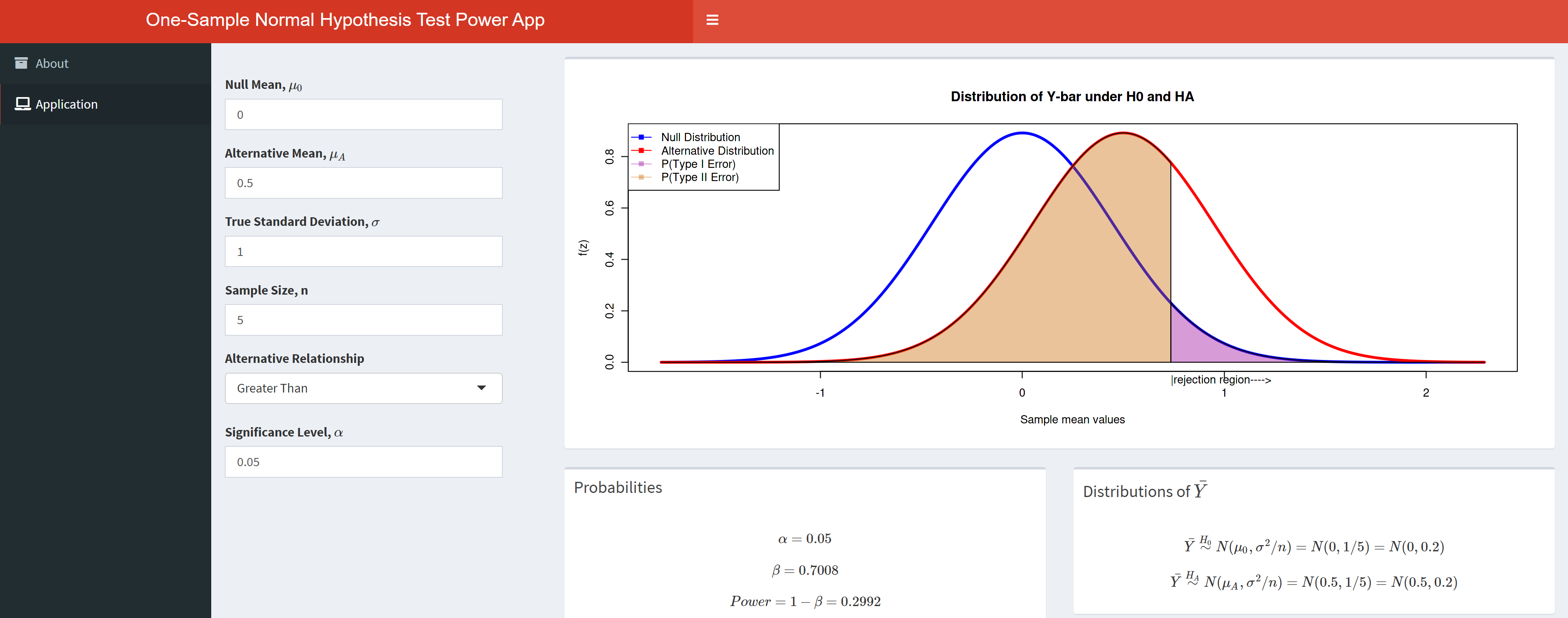
Normal Power App
A power applet to demonstrate the ideas surrounding power for a one sample mean test from a normal population with known variance.
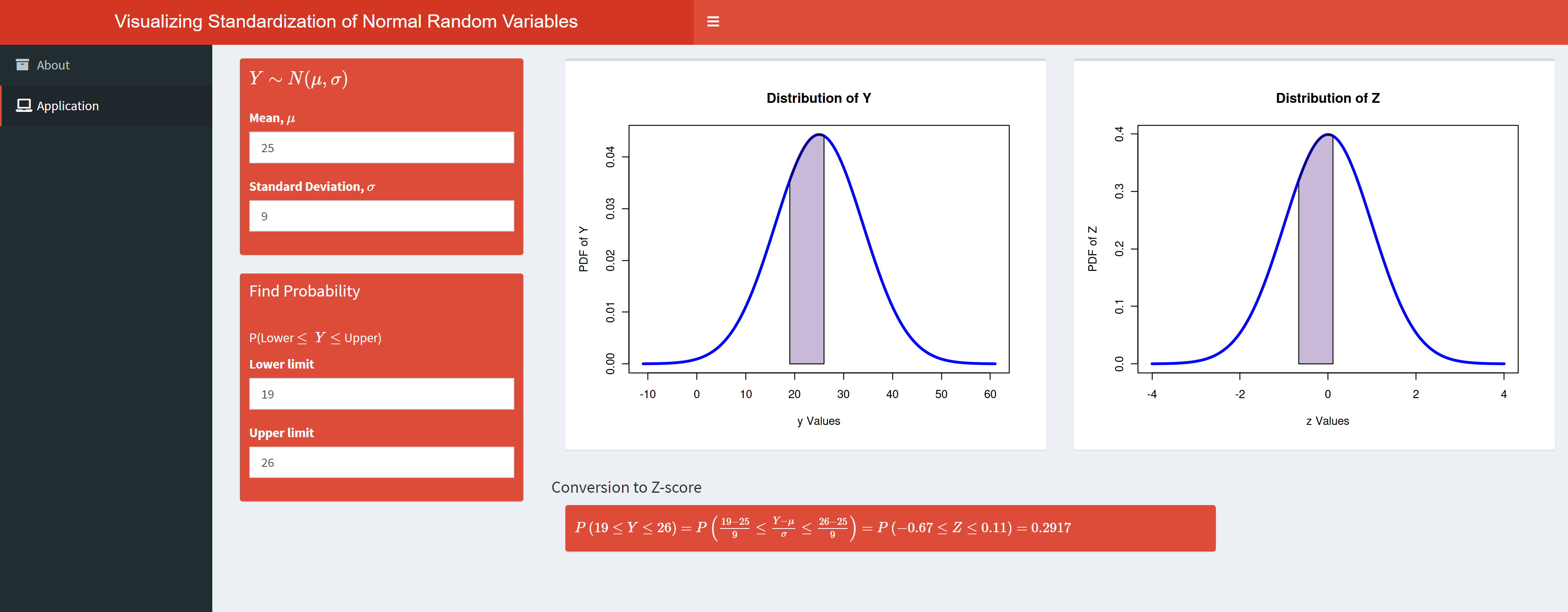
Z Score App
A basic applet to visualize probabilities for a Normally distributed random variable and the corresponding calculation for a Standard Normal random variable.
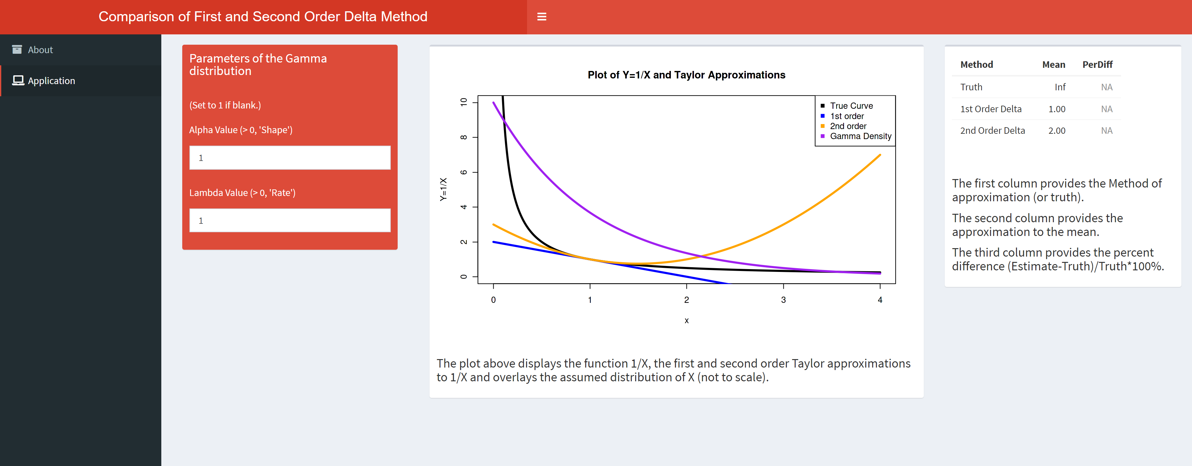
Delta Method App
An applet to visualize and compare the first and second order delta method approximations. Exact values for the transformation’s mean can be compared to the approximated values.
Transformation App
An applet to visualize the transformation from a Gamma to an Inverse Gamma Random Variable. The app attempts to show how the CDFs of the original random variable and the transformed random variable behave.
![]()
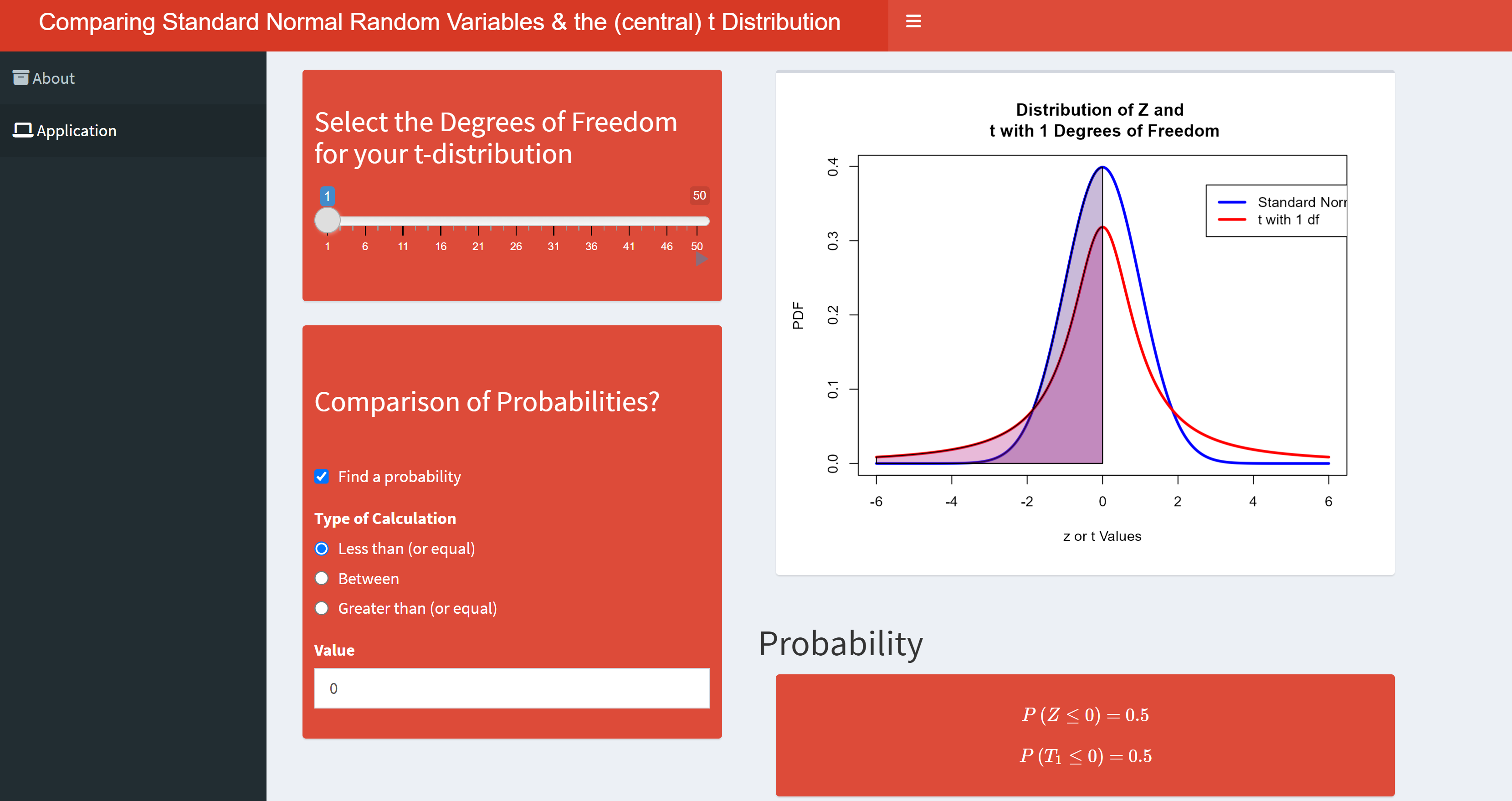
Comparing the T distribution to the Standard Normal App
This application visualizes the standard normal distribution and t distributions with user specified degrees of freedom. Probabilities can be calculated from each distribution and compared.
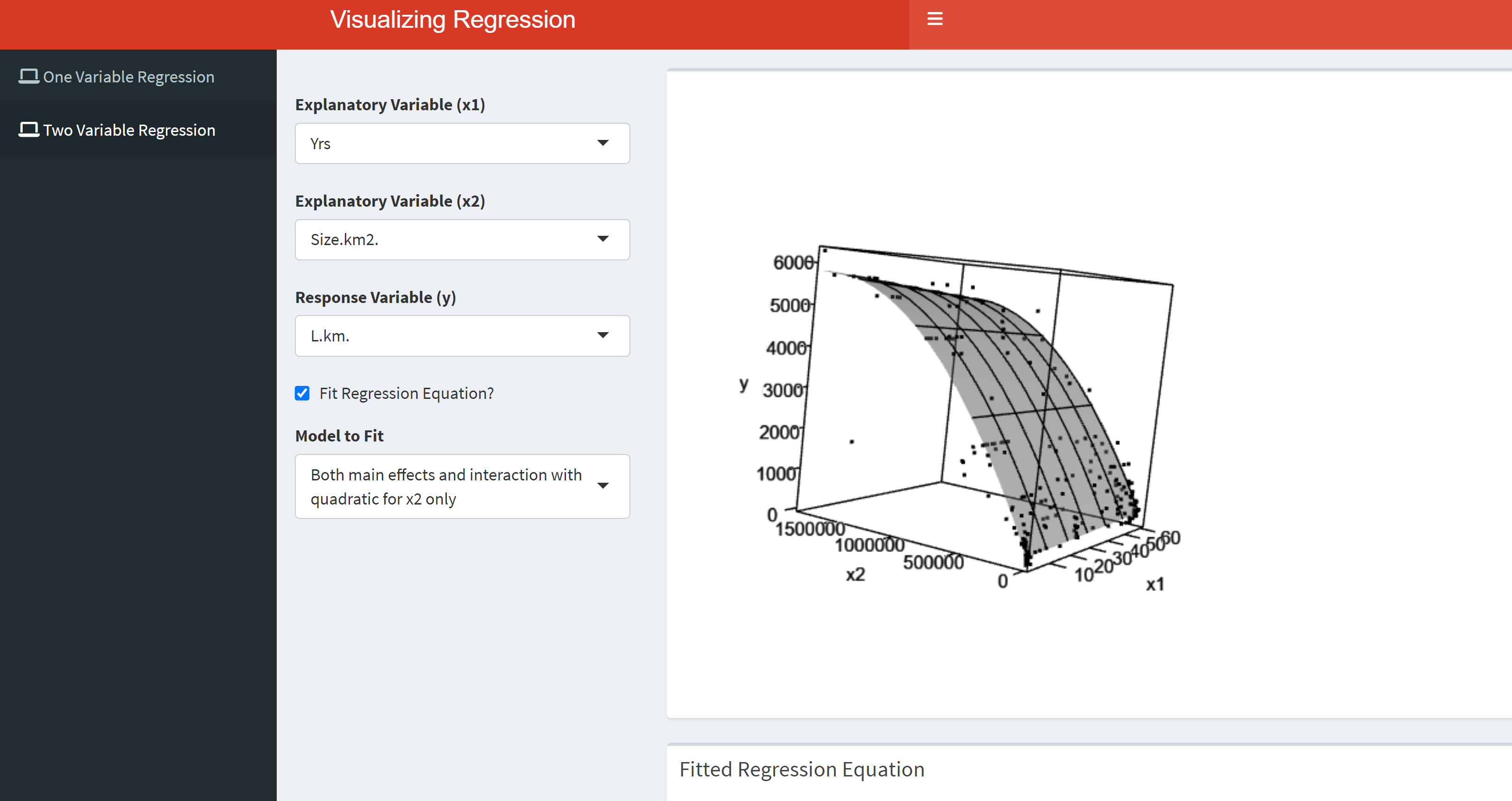
Visualizing Multiple Linear Regression Models
This app allows users to fit polynomial regression models, visualize the fitted models, and employ standardizations. Users can also visualize a variety of multiple linear regression models that include interactions and quadratic terms.
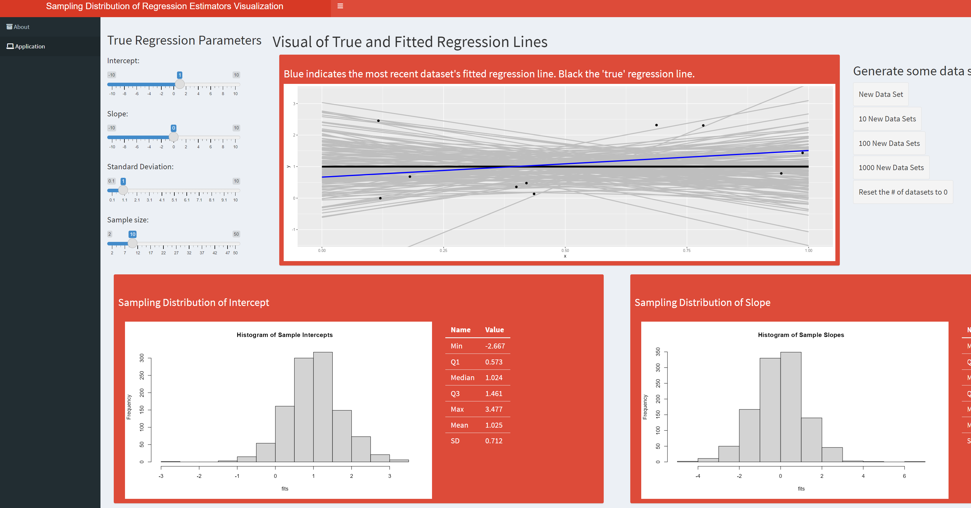
Visualizing Sampling Distributions in Simple Linear Regression
This app is meant to help visualize the variability of the fitted intercept and slope parameters of a simple linear regression line. The user can specify the true line to generate data from as well as the samples size and standard deviation on the errors.
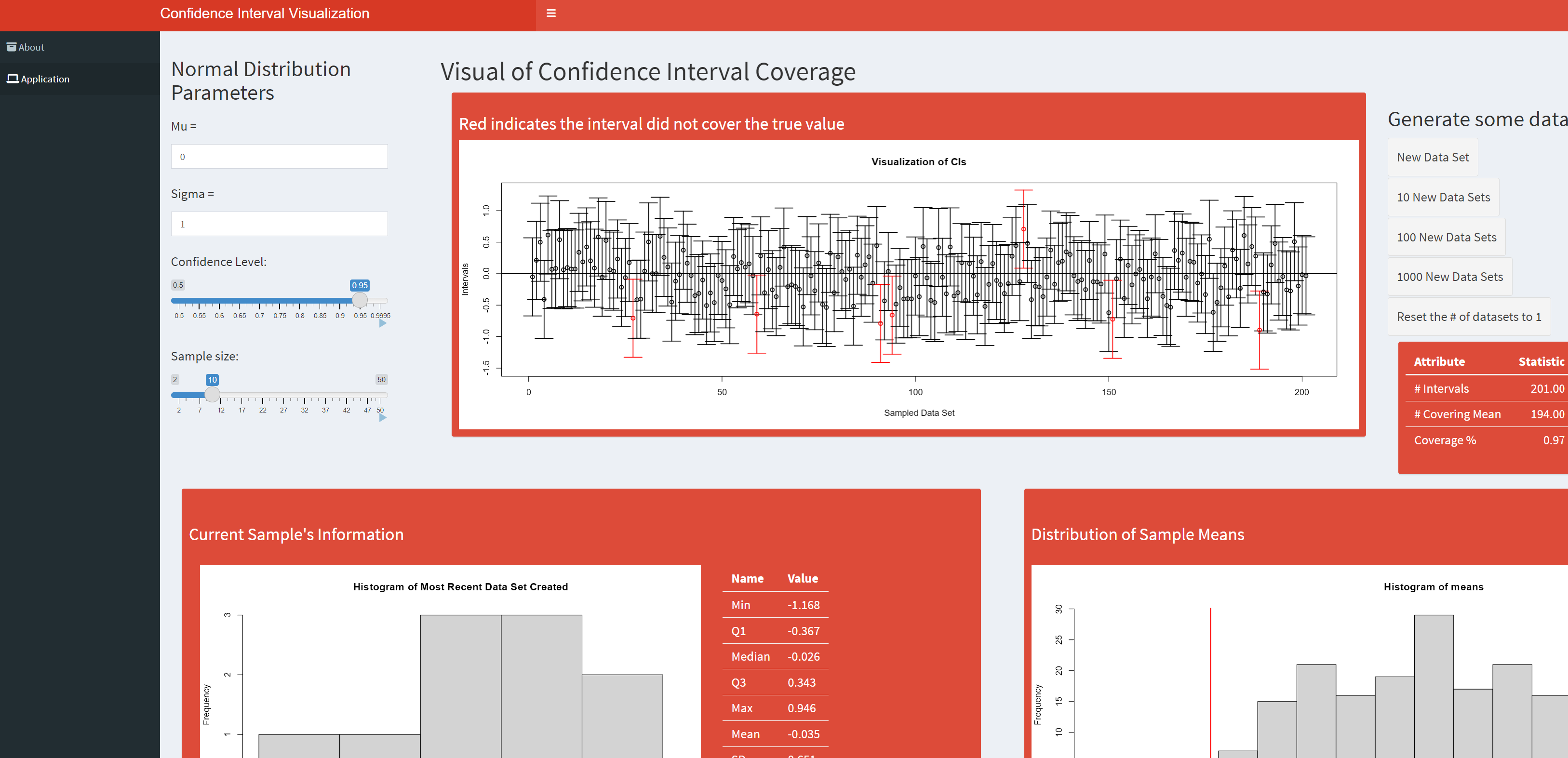
Confidence Interval Coverage Visualization
This app is meant to help visualize the idea of confidence interval coverage rates. Specifically, this app simulates data from a normal distribution of the user’s preference and fits the standard ‘one-sample Z interval’ where the population standard deviation is assumed known. The user can also specify the sample size and confidence level.
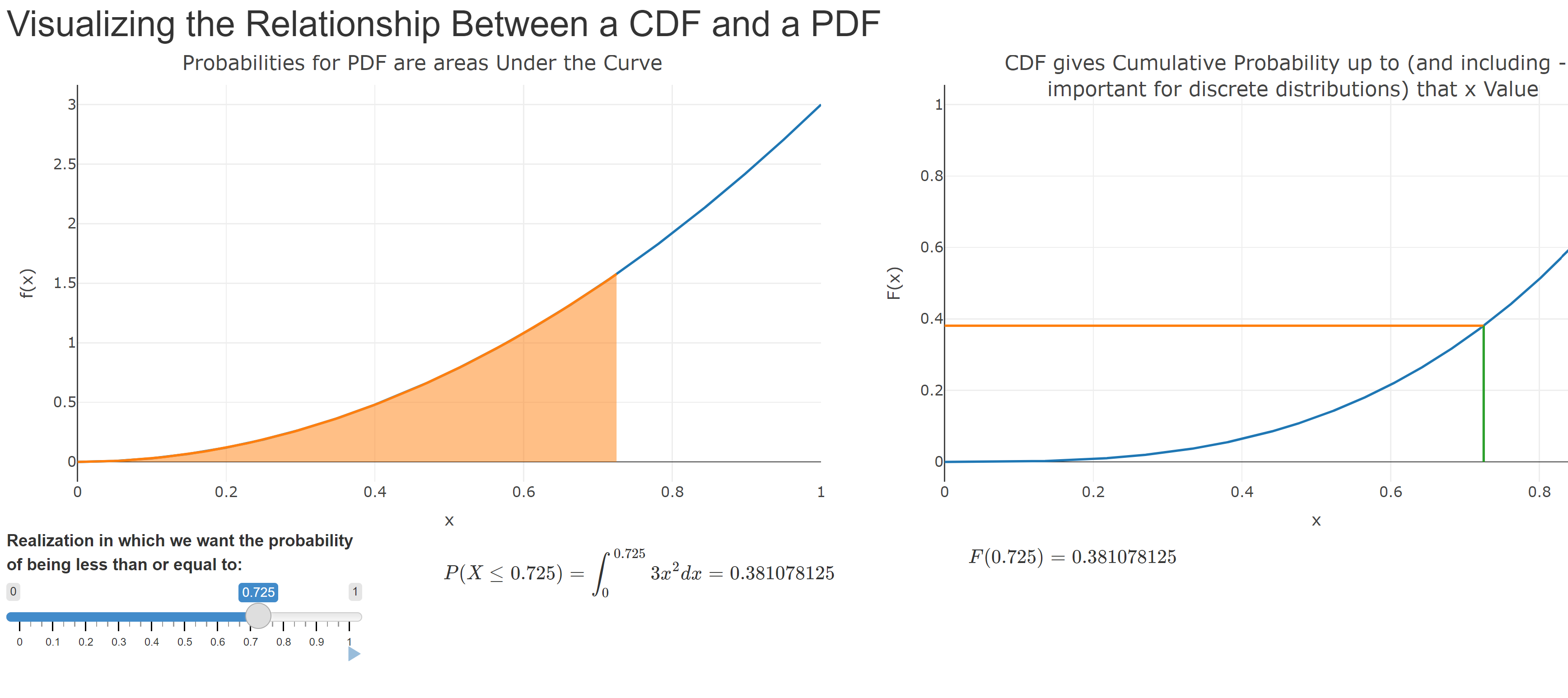
Visualizing the PDF and CDF Relationship
This basic app gives a visual representation of how the PDF and CDF are related in terms of probabilities.
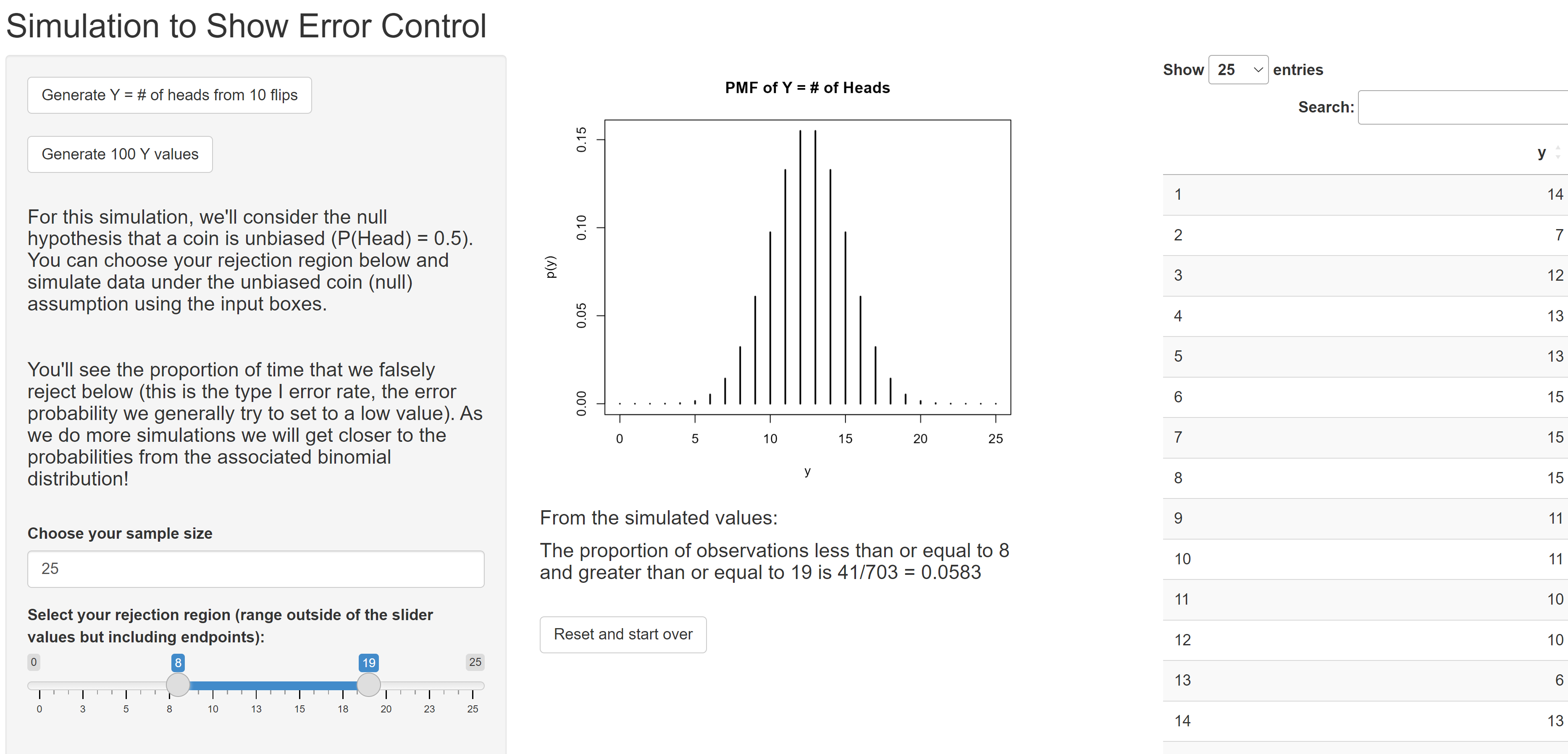
Investigating Type I Error Control when Sampling from the Binomial
An applet to simulate data from a Bin(n, 0.5), dynamically set the rejection region, and observe the proportion of falsely rejected null hypotheses (the empirical type I error rate).
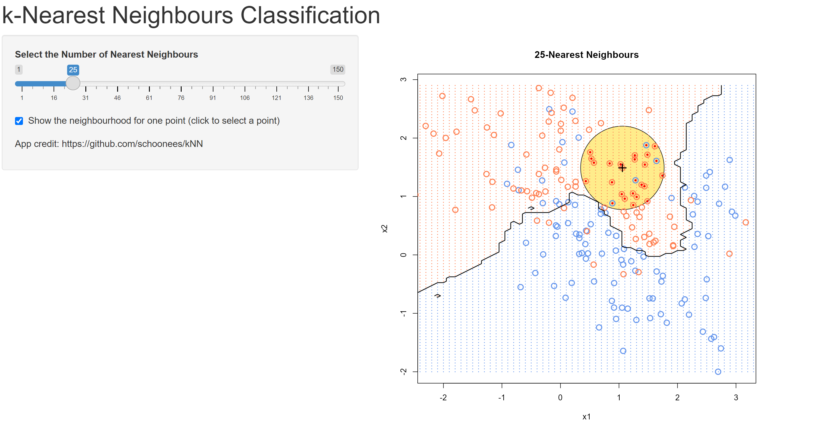
kNN Visual
This application is taken from https://github.com/schoonees/kNN. The app provides a visual of the KNN algorithm for an example taken from the Elements of Statistical Learning.
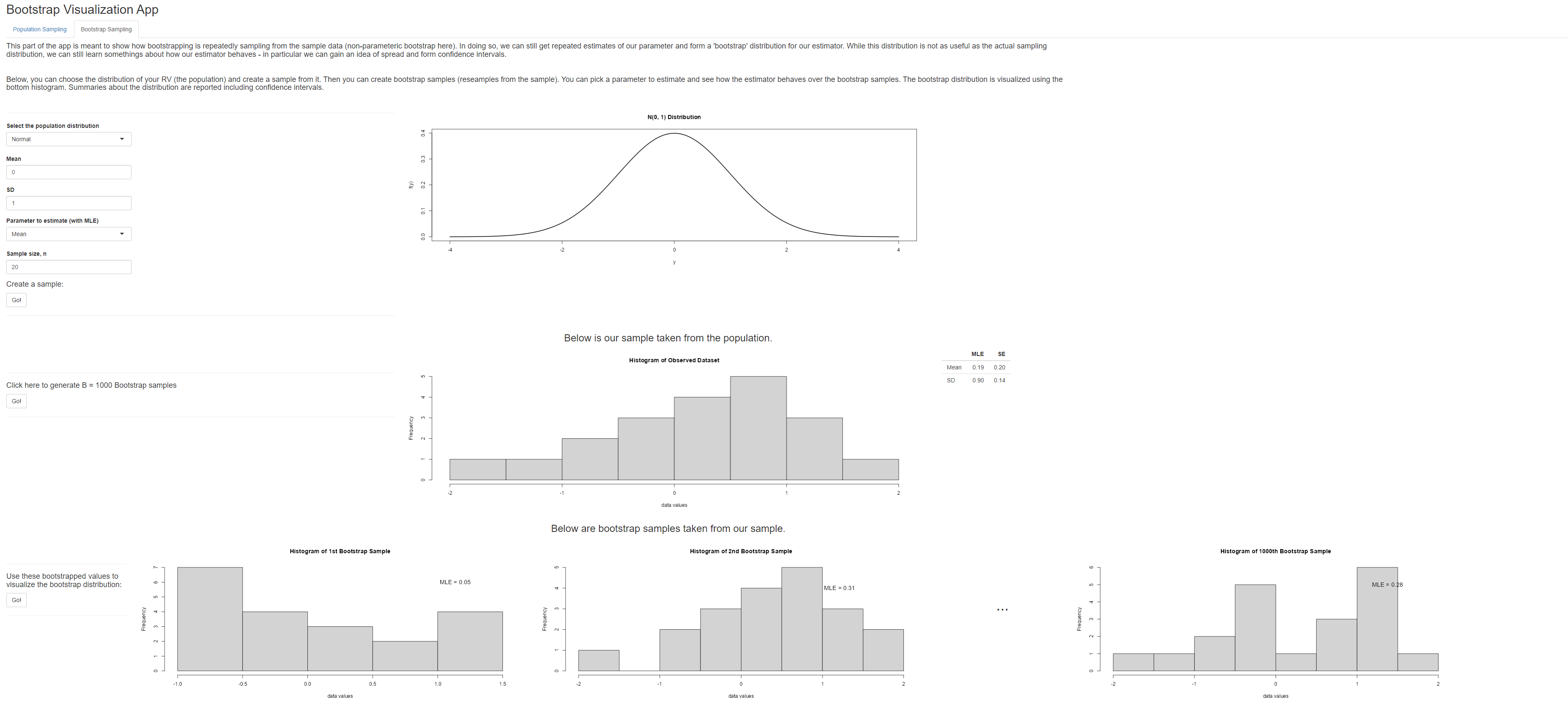
Relating Bootstrapping to Sampling Distributions
This app has two parts. One part that uses visuals to reinforce the idea of a sampling distribution. The second part of the app is meant to show how bootstrapping mimics the idea of the sampling distribution via a non-parametric bootstrap.
Other Useful Vis and App Sites
- Rossman Chance Apps
-
Rossman/Chance Applet Collection 2021
- Stat Key
-
StatKey to accompany Statistics: Unlocking the Power of Data
- Penn State - Book of Apps for Statistics Teaching
-
The book is laid out in twelve chapters with four at the introductory level covering topics in Data Gathering, Data Description, Basic Probability, and Statistical Inference and with eight chapters at the upper division level covering Probability, Regression, ANOVA, Time Series, Sampling, Categorical Data, Data Science, Stochastic Processes, and Biology.
- Gaston Sanchez - Apps for Feedman, Pisani, and Purves (2007)
-
This is a collection of Shiny apps for introductory statistics courses based on the classic textbook Statistics by David Freedman, Robert Pisani, and Roger Purves (2007). Fourth Edition. Norton & Company.
- Cal Poly apps
-
Web Application Teaching Tools for Statistics Using R and Shiny.
- Apps by Brittany Cohen
-
Statistics education apps created with Shiny.
- Stat 2 Labs
-
This stat2labs site provides project-based materials that emphasize real-world applications and conceptual understanding. The materials are designed to ease the workload of faculty while still incorporating research-like experiences into their own classes.
- Distributome.org
-
The Probability Distributome Project is an open-source, open content-development project for exploring, discovering, navigating, learning, and computational utilization of diverse probability distributions.